view the project
In May 2020, faculty, student, and community activists called for concrete and immediate action towards racial equity at the University of Virginia following the murders of George Floyd, Ahmaud Arbery, and Breonna Taylor. UVA President Jim Ryan asked the Racial Equity Task Force to create thoughtful and bold recommendations for racial equity at the University in response. But thoughtful and bold recommendations already existed in the records of student, faculty, community member activism in the decades since students of color were first admitted to the University.
The Racial Equity taskforce commissioned me to design and implement a virtual framework that compiled, contextualized, and analyzed historical calls to action for racial equity at the University. I proposed a design with a three fold mission (1) to inform the Racial Equity Taskforce's Recommendations based on historical trends, (2) to publicly cite the sources who first proposed many of the recommendations and ground current decisions in historical reasoning, and (3) to help current and future students contextualize themselves and their advocacy within a the lineage of their peers. You can read my full proposal for this project here.
To start, a team of professors and graduate students qualitatively coded 50 years worth of documents, highlighting specific calls for equity and categorizing them into concrete themes. Head to the voices for equity page to read more about our methods.
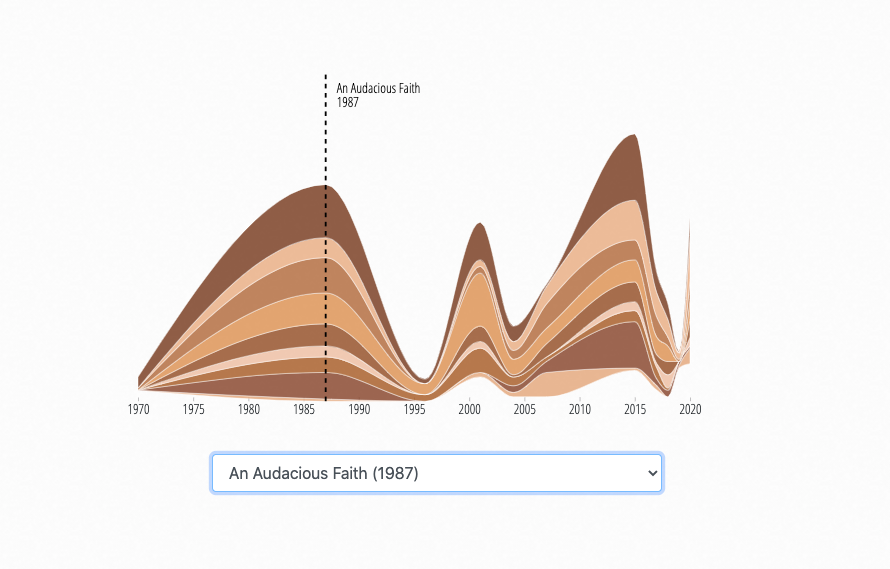
Meanwhile, I began designing a visual framework to contextualize the documents in relation to each other, to the individuals who wrote them, and to historical events preceding and following. The authors of these documents were both responding to and creating history. We wanted to emphasize that as much as possible.
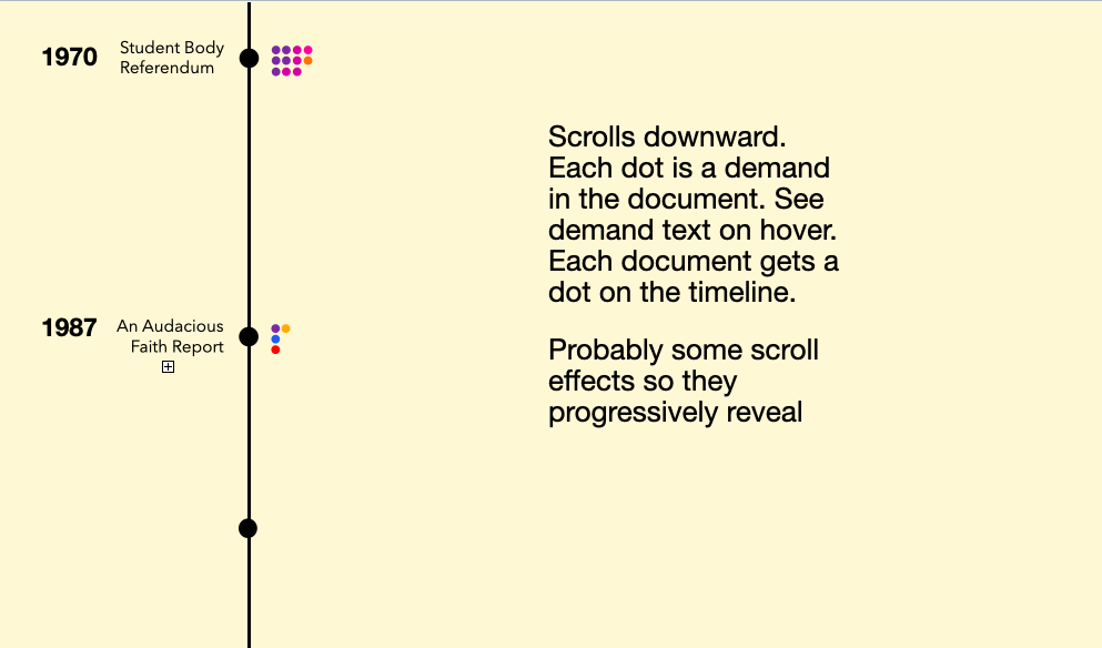
To do this, I knew I wanted to have some sort of timeline as well as a physical representation of each concrete demand that our research team coded from each document. So I started by thinking about each call to action as a point in the document. Sketching it out, I ended up with the concept below:
But after playing around with a few other configurations that had dots, I realized I really wanted something that represented text and words a bit more viscerally. So drawing on the idea of lined paper, I made each distinct call to action a line on the page, coloring them by category.
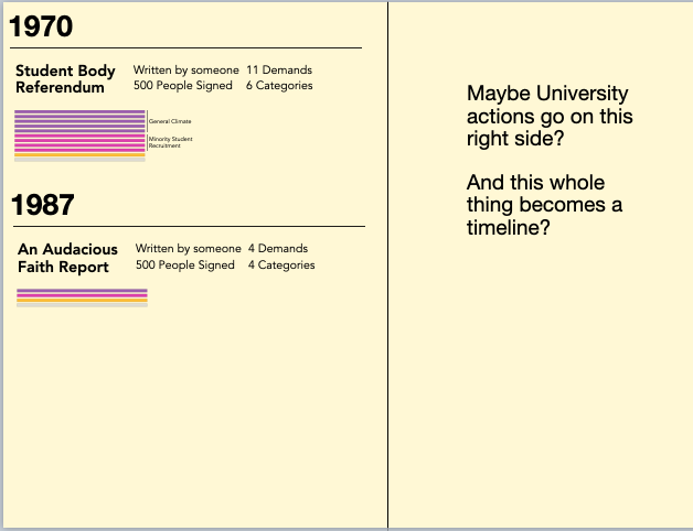
After circling with some colleagues, they agreed that the idea of lines was much more intuitive than dots. However, I was a bit concerned that the height of the line stacks and the number of distinct colors would get out of hand, especially with the vertically stacked time line. Too long of a document and time would be so distorted.
I tried first disaggregating the lines and then turning the whole time line horizontal.
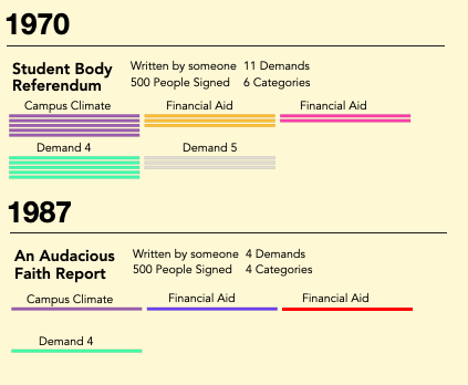
With the horizontal timeline, I experimented with having the full array of colors on the lines all at once, but with 13 coded categories, it became too much. Instead, I chose a filtered approach.
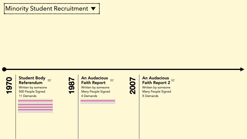
The final shift to the information encoding design came when I shifted from sketching into code. A few of the documents had so many calls to action in them that the columns of lines became overbearing and really lost their meaning. For this reason, I decided to group the calls to action into sets of 10, forming "pages" of demands as opposed to long running columns. I think this presents the most intuitive way for readers to see patterns in what was written while also mentally encoding dimensions like volume of text in manageable ways.
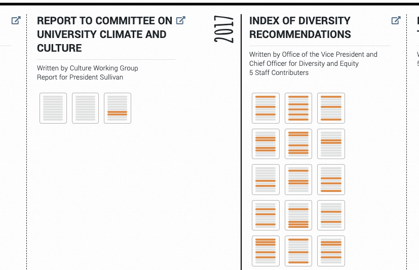
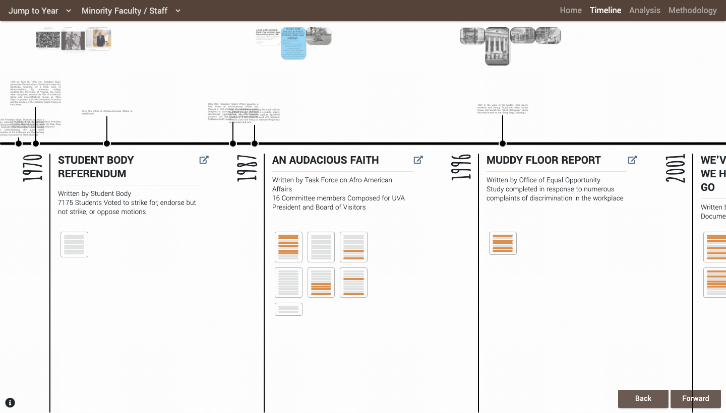
Following an overarching design suggestion from Professor & UVA Equity Center design consultant Elgin Cleckley, I re-tooled the colors drawing tones from Rihanna's Fenty Beauty make-up tones to subtly cue readers into this project's celebration of representation and color.

When we presented this project for community feedback prior to public release, people were particularly struck by the color palette, emphasizing how special it was to them that we had displayed the beauty of a predominantly brown palette. You can access the final timeline here.
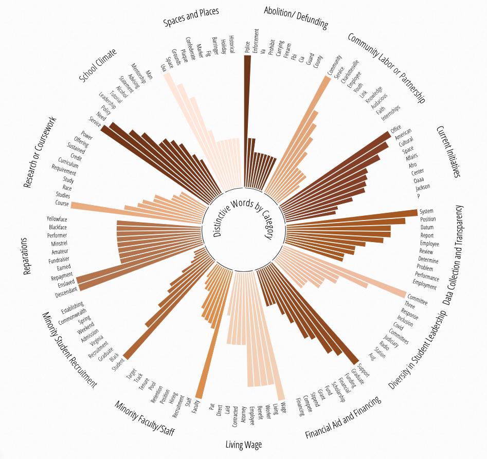
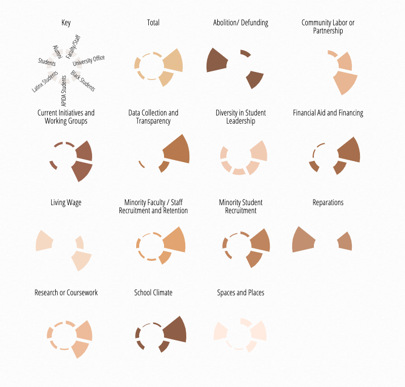
I also integrated the Fenty palette into my quantitative analysis of the calls for action. We had about a month and a half to complete this project from initial proposal to project launch, so I did not get to take as much time drafting and innovating the analysis graphics as I usually would like. But I believe that collectively they integrate well to tell a cohesive story about the fight for racial justice at UVA.
impact & reception
This project assisted the Racial Equity Taskforce in identifying concrete domains for University action and served to educate community members about UVa's history and needed steps for the future. Archetypal comments from reviewers included notes such as "This project could have easily resulted in a boring report, but the group chose to create an interactive, beautiful, informative, and accessible site" and "Heartened to see the University embracing previous work, publicizing it, and building on it to make real progress". For me personally, it was exciting to hear UVa President Jim Ryan's reactions as he engaged with our work, taking to heart the long story of the University over which he has been given care as well as the reactions of individuals in the Charlottesville community as they say their voices amplified within an institution that has traditionally contributed to their marginalization.